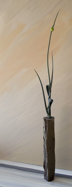
In choosing photos for the web I find that horizontal ones tend to work better because of the dimensions of screens. but every once in a while I can't resist a tall narrow photograph. It acts kind of like a waterfall for the viewing experience.

'In graphic design, the word "river" refers to the white space between words that sometimes connects in a rippling vertical pattern down the printed page. Such a river is to be avoided because it can interrupt the flow of text in an irregular pattern and distract the reader's eye from the horizontal progression of the printed words. But just as it may be a distraction, that space between words also confirms their meaning. If a river can both separate and connect on the printed page, it is capable of doing this all the more in the natural world." Just beneath the surface Akiko Busch

'In graphic design, the word "river" refers to the white space between words that sometimes connects in a rippling vertical pattern down the printed page. Such a river is to be avoided because it can interrupt the flow of text in an irregular pattern and distract the reader's eye from the horizontal progression of the printed words. But just as it may be a distraction, that space between words also confirms their meaning. If a river can both separate and connect on the printed page, it is capable of doing this all the more in the natural world." Just beneath the surface Akiko Busch
Leave a comment